Welcome to the 135th edition of The Week in Polls (TWIP), which travels across the Atlantic again for another look at what the data can tell us about the US election.
Then it’s a summary of the latest national voting intention polls and a round-up of party leader ratings, followed by, for paid-for subscribers, 10 insights from the last week’s polling and analysis.
But first this week’s gentle sigh of disappointment is triggered by The Independent, which reported a poll showing the Conservative vote share up one and the Labour vote share down with the claim that this “suggests that Kemi Badenoch has already made an impression on voters” and even that “Kemi Badenoch slashes two points off Labour’s lead in her first week as Tory leader”. At least the latter was then updated to “cuts”. Even so, that still is making a claim for reality having shifted when two figures twitching in opposite directions by a single point each is very far short of evidence for anything having changed, let alone that Kemi Badenoch is personally responsible for the (unproven, possibly non-existent) change.
Thank you to reader Nigel for highlighting the original headline to me.
If you’re not yet a paid-for subscriber, sign up now for a free trial to see what you’re missing:
Want to know more about political polling? Get my book Polling UnPacked: the history, uses and abuses of political opinion polling.
More graphs, more American analysis
The graph so many people are getting wrong
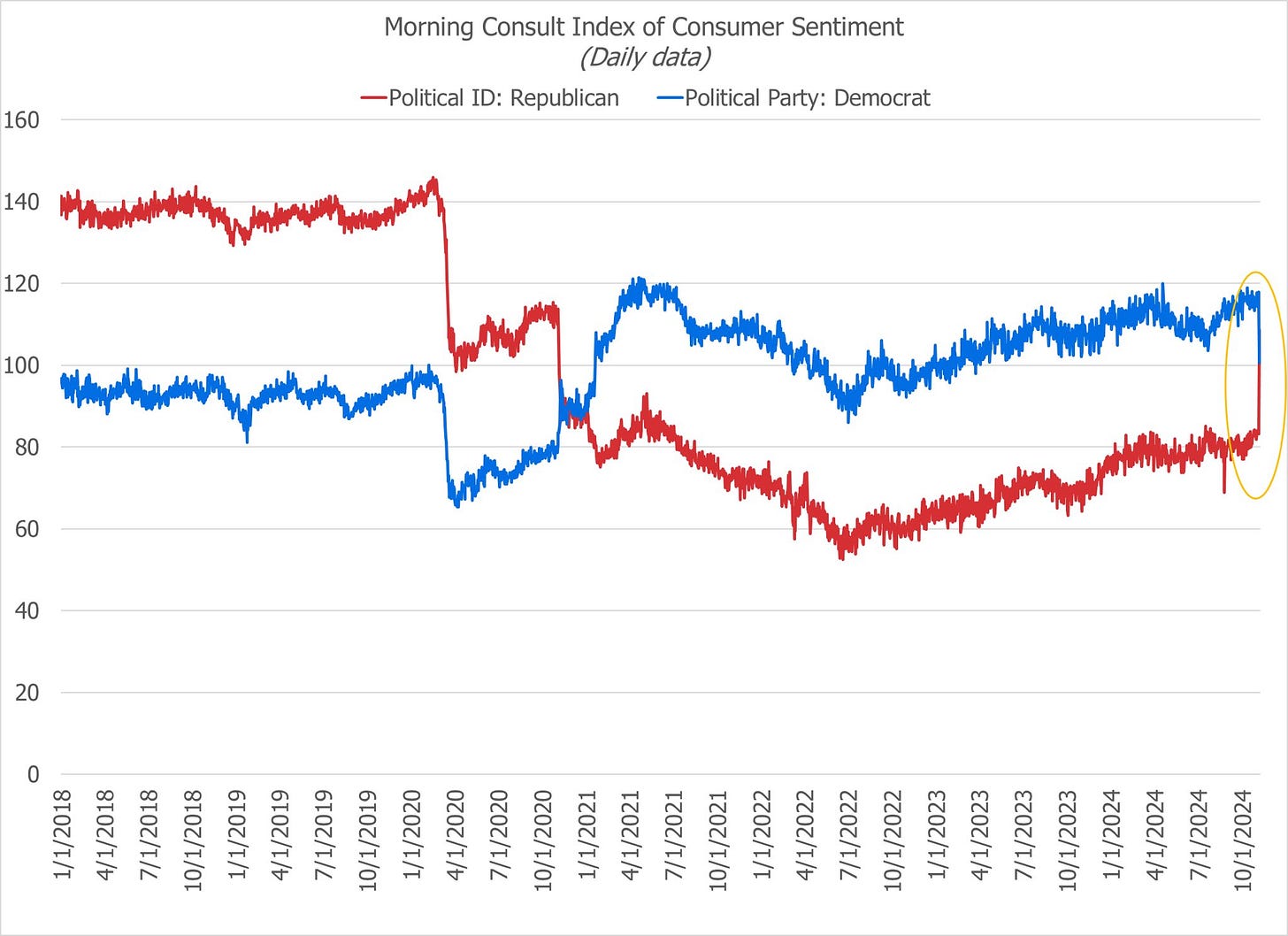
There is a graph of economic sentiment in the US doing the rounds, often accompanied by sneering comments about partisanship and political views trumping reality.
But I dissent.
I think it shows the American public reacting in a sensible, informed and rational way.
Let us start then with the data itself, which is reputable regular polling from Morning Consult, and accurately plotted in the graph doing the rounds:

What gets some people exercised is that bit circled in yellow. Following Trump’s win, consumer sentiment among Republican voters has soared and among Democrats nose dived. For those people there is often a tone of dismissiveness about how dare the public change its views like this? Underlying economic reality - inflation, unemployment, interest rates etc. - have not changed, so let us all despair at people’s answers changing so much in response to an election result. Partisanship is beating reality to a pulp and we should despair.
I dissent.
The Morning Consult polling is a mix of questions asking how people view the past and how people expect the future to go. Either way, the election of Trump is a reasonable, rational, informed reason to change your answers.
Imagine that this evening’s news comes with a shock revelation that Keir Starmer is travelling to Bonn tomorrow to hold a joint press conference with Emmanuel Macron and Olaf Scholz to start negotiating Britain rejoining the Single Market.1 Now imagine that the following day you are polled.
It would be reasonable, rational and informed for you to think, ‘well, the last year includes that press conference so the last year now suddenly looks much better/worse than I thought before’. The same too for thinking ‘and the year ahead? yes, that too now looks much better/worse’.
We can leave the fighting between pro- and anti-Europeans about whether it would be better or worse for the comments thread. The point is that changing both your retrospective and prospective views is nothing to sneer at. All it shows it you see a substantive difference between being in or out of the Single Market.
Or to return to the graph, all it shows is that Americans see a substantive difference caused by who is in power. That is good for a democracy. Even when the democratic outcome is not one you agree with.
Incumbents on the ropes
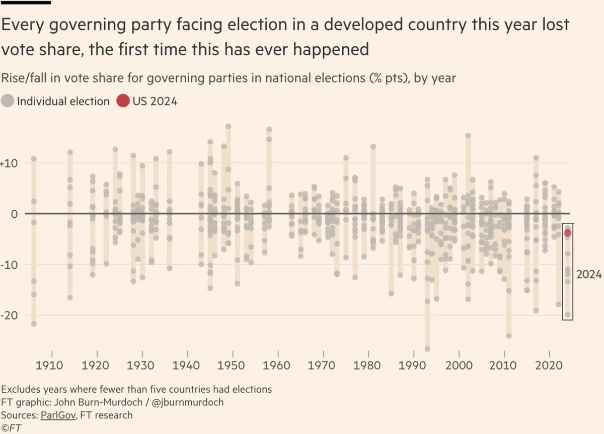
Last time I shared a graph from John Burn-Murdoch showing how every incumbent government up for election this year had lost. He has now extended the data back to 1905 and it is still the first time this has ever happened in the data set:
An interesting question this graph prompts is: why have previous periods, such as the inflation shock caused by oil prices in the early 1970s, not produced a similar outcome? In other words, if the obvious explanation for 2024 - cost of living pressures around the world - is right, why did that phenomena only produce this outcome this time around?
Racial de-polarisation?
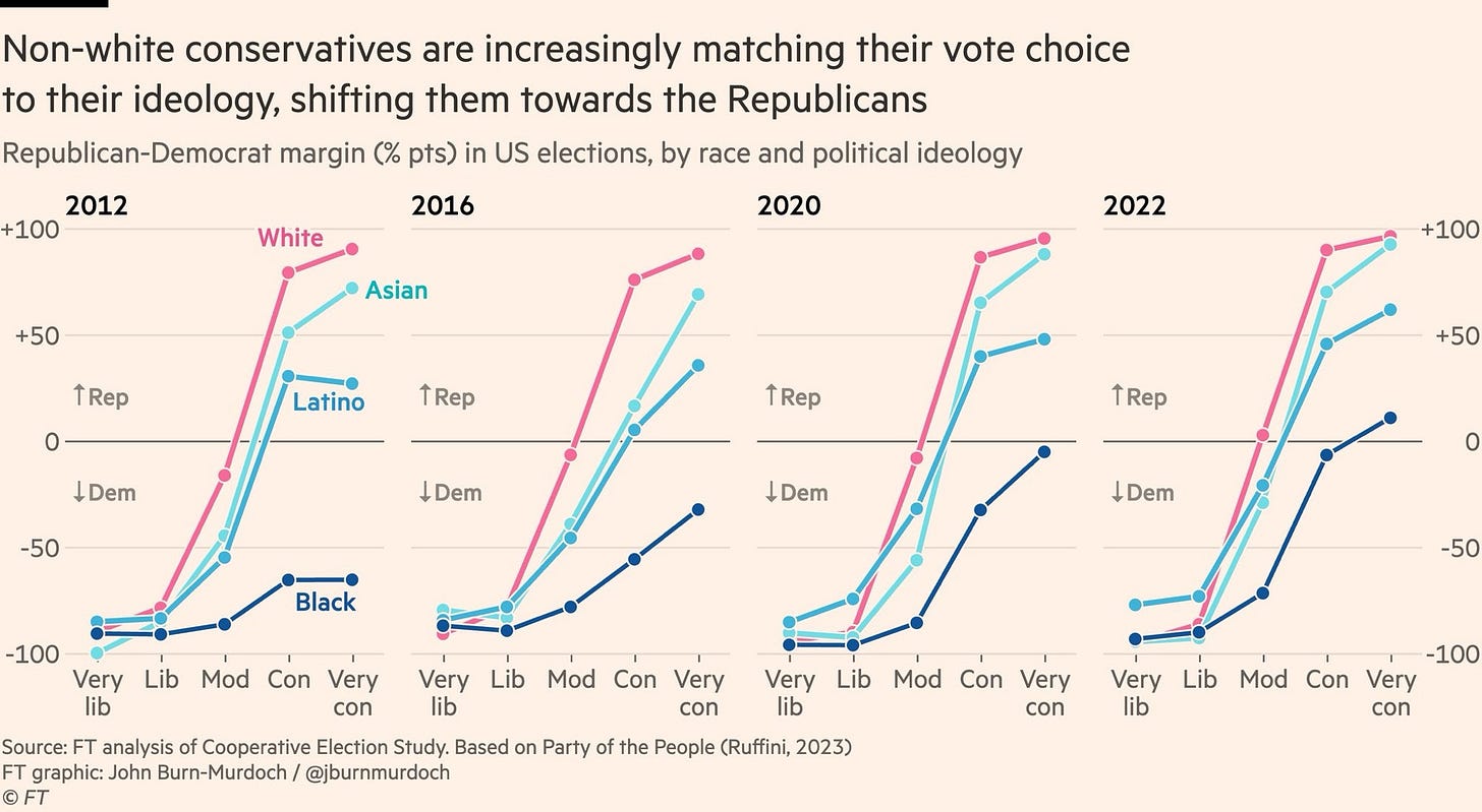
He also has another graph out, looking at the data on what is often called racial depolarisation. It is the likely - though debated - trend away from ethnic minorities heavily backing the Democrats (US)/Labour (UK) and instead making political choices more in line with their other views, such as socially conservative people picking socially conservative parties or candidates.
The 2024 data seems to support the argument that this is a real and substantive trend:
In the UK context, James Kanagasooriam has made a similar case. For example, as I quoted a few weeks back of a report he co-authored:
British Indians and British Chinese voters tend to be right wing on the economy, expectations of the nation state, and views on welfare. Other minority groups sit much more firmly on the left. If politics reorients to be based primarily around economic divisions, this may lead to even greater fragmentation of minority opinion.
The revenge of the median voter?
Continuing the JBM love-in this week, here is one final graphic from him.
Pay attention first to the light grey line, the median voter. That shows that on both measures, the US overall has got more liberal in the last couple of decades.
Next look at the line for the strongest Republican voters. They have got less liberal, and moved further away from the median voter.
That all sounds good for Democrats, perhaps. Voters moving towards them and their strongest opponents moving further away from the typical voter.
Ah but look at their line too:
I suspect there will be plenty of Keir Starmer supporters reading this (and hey, let’s indulge myself and say perhaps him too?) who will look at that and think this is just why he has been on the political arc that he has. Depart too far from the median voter and their move towards you gets swept away by the electoral tide against you.
Uniform swing for the win
The last graph is not a polling one itself, though it helps explains what happened. Note the uniformity of the swing (and perhaps also a long-term trend towards more uniform swings in US elections):
UK coverage of US elections is often heavy into coverage of clever targeting tactics and the importance of swing state campaign drives. Yet the nation as a whole moved in pretty much the same way. Which suggests all that cleverness and targeting either did not make much of a difference or each side just cancelled out the other.
More substantively, as Stephen Fisher points out, this uniformity is another clue that the election result was caused by national factors, principally the economy, particularly as, “the most economically insecure socio-demographic groups were the ones that apparently swung most to Trump”.
Two final thoughts
First, I put the case last time for why the polls had been pretty good this time around in the US election. The above reinforces the value of polling: look how much extra insight it gives us.
Second, I joined James O’Malley to discuss some of this in a live chat, which you can take watch of here:
Voting intentions and leadership ratings
Here are the latest national general election voting intention polls, sorted by fieldwork dates:
Next, a summary of the latest leadership ratings, sorted by name of pollster:
For more details, and updates as each new poll comes out, see my regularly updated tables here and follow The Week in Polls on Bluesky.
For the historic figures, including Parliamentary by-election polls, see PollBase.
Last week’s edition
How did the polls do in the US elections?
My privacy policy and related legal information is available here. Links to purchase books online are usually affiliate links which pay a commission for each sale. Please note that if you are subscribed to other email lists of mine, unsubscribing from this list will not automatically remove you from the other lists. If you wish to be removed from all lists, simply hit reply and let me know.
How long do people take answering polling questions?, and other polling news
The following 10 findings from the most recent polls and analysis are for paying subscribers only, but you can sign up for a free trial to read them straight away.
I often warn against reading too much into the subtlety of a polling question’s
Keep reading with a 7-day free trial
Subscribe to The Week in Polls to keep reading this post and get 7 days of free access to the full post archives.


